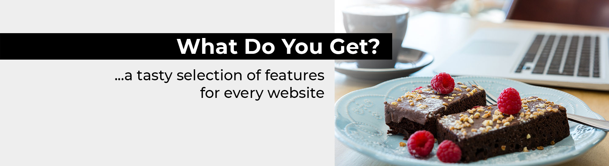
The best way to discover our website features is to see them in action by using our free trial. This demonstration website highlights a lot of the new features we have launched recently and please visit our web templates page to get a feel for the vast range of colours and styles we have on offer.
Each website created at QUICK ON THE NET is provided with the internet service features listed below:
Every website at QUICK ON THE NET is provided with a search box. This internet service feature will allow visitors to perform a search on your website, searching through all of your web pages and all of your gallery items.
This search feature is fully automatic and you don't need to do anything to make it work.
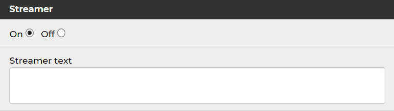
This is a ticker-tape message streamer service for your home page. You can edit the text content of your message streamer to suit your needs, or turn it off if you wish.
You can choose to put password on the home page of your site. You would do this if you wanted to make your website private, and therefore not viewable to the public.
This is separate from the username and password you will receive to access your website toolkit, which you will use to log in and update your website.
This feature will help to spread the word about your new site. It allows your website visitors to automatically forward an email link to your website to their friends and colleagues.
How popular is your site? This feature will count the number of visits to your website. It operates on the small footer bar and you have the option to turn this feature off. Please see the 'No Footer Bar' Upgrade if you wish to remove the visit counter from the bottom of your site.
Free of charge, you can also use Google Analytics and Google Webmaster Tools for more advanced information about your website visitors.
We offer full social media support within our website service and site builder toolkit. We deliver this functionality in a simple user-friendly manner for you and your website visitors.
The world's leading providers of social media platforms have been involved with a lot of high-profile scandals concerning privacy and data sharing.
We would like to point out that our social media technology is non-invasive, safe, secure and easy to operate.
We would also like to emphasise that the social media features we provide do not post anything on your Facebook wall, your Twitter page or any of your other accounts.
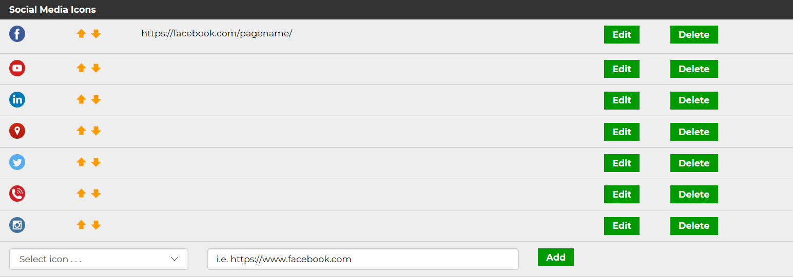
Unique to your website, you can easily integrate your website with your existing social media accounts e.g. your own Facebook page, your Twitter Feed, your YouTube Channel etc.
All you need to do is insert the URL to your social media account pages and select an icon for each account.
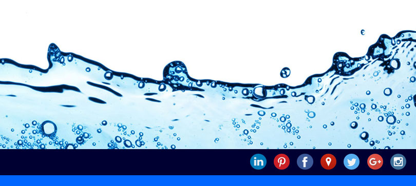
The social media icons are presented within a solid coloured bar. You choose the colour and you can also control the alignment and position of the icon bar. Colourful and simple, this feature will add a new dimension to your website and it can also help to boost the popularity of your website on search engines.
At the click of a button, all your web pages have social sharing for Facebook, Linkedin, Twitter, and WhatsApp.
This new feature is actually immediately available to you, even if you are not yet using social media technology yourself.

Your new website created at QUICK ON THE NET is fully optimised for mobile phones without you even having to think about it.
Your new site is actually optimised for mobile/cell phones, iPads and tablets, along with the largest desktop computer monitors and laptop screens.
The website pictures and contents will automatically adjust and resize to fit the device you are using. In other words, pictures which appear large when viewed on a big computer screen will automatically reduce in size and adjust to fit the screen on a mobile phone browser. Similarly when the screen area is reduced in size on a smaller device, the menu system will collapse into an expandable drop-down menu.
What is responsive website design? A responsive website will automatically adapt to fit the device you are viewing the website on.
This means small screens or the largest monitors, viewed in landscape or portrait mode, high resolution or low resolution, it doesn't matter, we've got this covered.
The website pictures are also automatically optimised for mobile phone display. In other words, pictures which appear large on your website when viewed on a computer will automatically reduce in size and expand to fit the mobile phone display.
The mobile technology described above automatically above runs in the background without you having to plan for it.
In other words, just create your new website for a laptop or computer monitor and the mobile phone display will automatically take care of itself behind the scenes.
After you have uploaded your pictures and created a gallery, at the click of a button, you can create different styles of gallery presentation.
In the toolkit, we provide arrows which allow you to sort your gallery images into a preferred sorting order.
Example: Feature Panels
This is a new way of displaying your image gallery. Any web page on your website can have 'Feature Panels' and they appear on screen using an animated effect.
Example: Carousel
A picture 'Carousel' is sometimes described as a 'slide show' or a 'slider' and it is created using large pictures which sweep across the screen.
You have the option of creating a 'link gallery' and then each 'Carousel' picture will click through a link destination of your choice, including links to external websites, if you wish.
Example: Thumbnail Gallery
We automatically provide a collection of small thumbnail pictures at the bottom of the screen. You can use the thumbnail pictures to navigate between each large gallery picture.
Example: List Gallery
This style of gallery works particularly well as a product shop or a job board listing. Miniature gallery pictures are presented in a vertical listing and each picture clicks through to a large picture and gallery item detail page.
At the click of a button, any gallery can be presented as a link gallery, whereby each gallery picture has a hyperlink.
For each hyperlink, you can choose to link to a new browser window, or stay within the same browser window.
Your website toolkit is used for designing your website and also updating the website contents.
When you log in for the first time and you start to design your website , most of the creative design work takes place in 'Upload' and 'Style' and 'Setup'. These features will allow you to create your overall website colour scheme and add your uploaded pictures.
After you have finished your website design project, when it comes to updating the contents in your website, most of the routine updates will take place in 'Pages' and 'Galleries'.
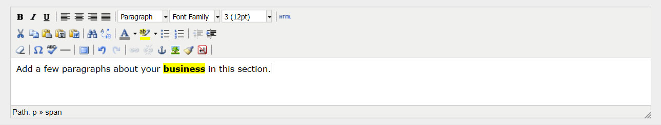
The 'Pages' area will allow you to edit each individual page, insert pictures and set up the Search Engine Optimisation (SEO) for each page.
This is a ticker-tape message streamer service for your home page. You can edit the text content of your message streamer to suit your needs, or turn it off if you wish.
The 'Galleries' area of the toolkit will allow you to create galleries, choose gallery styles, add individual gallery items and determine the sorting order of your gallery pictures.
The 'Social' area of the toolkit allows you to set up your social media features.
Most of the social media tools operate through simple buttons to turn the services on/off and set up the alignment according to your preferences.
The 'Footer' area allows you to set up the large footer at the bottom section of your website.
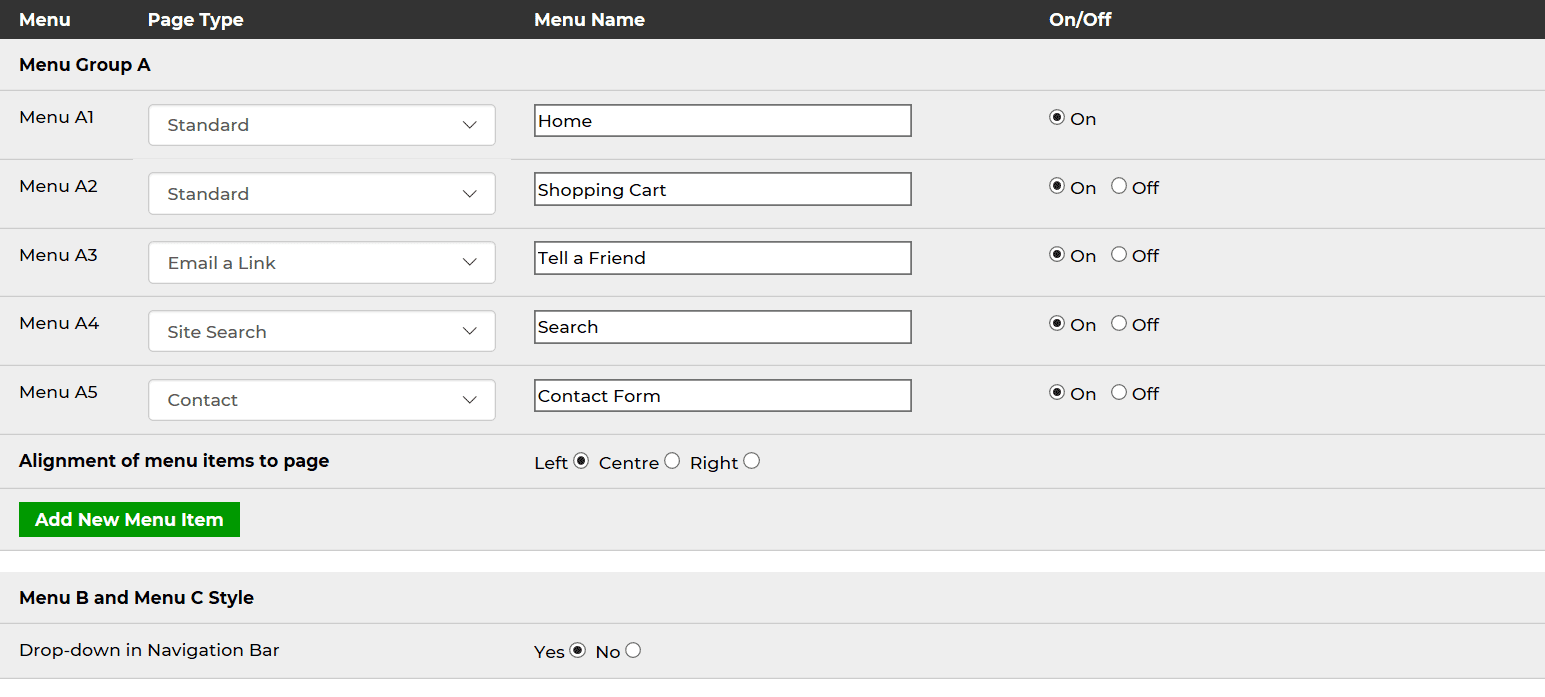
The 'Menu' feature will allow you to name your menu buttons, or add and remove menu buttons.
This section will also allow you to select the type of web page you wish to display and set up your drop-down menu.
You can upload and use your own company logo, background, pictures and graphics. The pictures are neatly grouped into logical sections, such as logo, page pictures or gallery pictures.
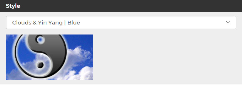
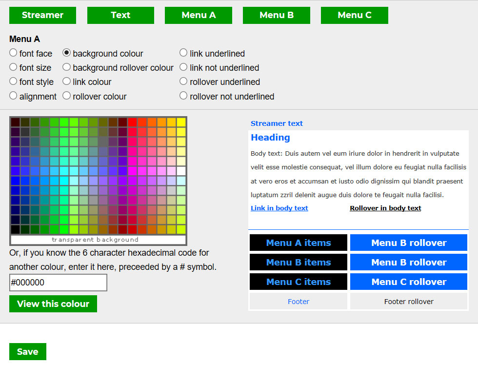
The 'Style' section of the toolkit will allow you to apply different colour palettes to your entire website at the click of a single button.
We provide a collection of pre-designed colour palettes and if you launch the 'Stylesheet Editor', you can create a unique style, if for example you wish to match your logo branding colours.
The 'Setup' tools will allow you to set up the global page and background colours and choose the logo or picture for the top section of your website.
This feature will delete your existing website and give you a fresh start.
Our website service is backed up with free help and support and we're here to help you along the way.
This section will show you the range of upgrades available for your website.
The 'Preferences' area of the toolkit will allow you to setup the global settings for your website, including your domain name, your password and your contact form email settings.
This section contains your contact details for your website account.
At the click of a button, you can log out of your website toolkit with ease.
We have modernised and improved the technology behind our website menu system. Whilst keeping everything simple and easy for you and the users of your website, the new menu system looks attractive and it works equally well for small sites or large complex websites with lots of pages and content.
We have modernised our systems to produce an improved menu system. The toolkit which you use to create the website menu has also been simplified and improved.
Our website toolkit now has a new drop-down menu system. To turn on the drop-down menu, you only need to click a single button in your website toolkit.
As a new feature, you can name the menu name sits above each drop-down listing.
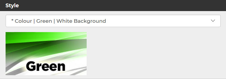
At the click of a single button, you can change your entire website to a different Colour Style at any time. For example, you can change your website from a blue style to a green style by clicking just one button and that will change the colours across all your web pages from shades of blue to shades of green in one swoop.
If you have an existing logo for your company or sports club and you have clear ideas on colour choices and branding, you will be interested to know we have designed a collection of the most popular Colour Styles using a range of attractive colour palettes for business and sport.
Broadly speaking, the colours we offer are unlimited, but you will find it quick and easy to use one of these colour styles as a starting point, and then modify it to match with your exact branding requirements.
The website stylesheet controls colours, typefaces, menu button appearance and hyperlink appearance. For example, you might wish to match your website menu button colours with the colours in your company logo. The stylesheet editor is very easy to use and it will ensure your website colours look the same as your company branding colours.
We offer a stylish range of pre-designed web templates for business and sport.
You can use one of our templates as a starting point and then customise it for your own use. For example, you can easily add your own business logo, change the colours around and upload your own pictures. You can also add and remove menu buttons or web pages to suit your needs.
We invite you to view the templates in the following categories:
Accommodation #
Agency #
Art #
Business #
Charity #
Driving #
Education #
Food and Drink #
Health and Beauty #
Home Improvements #
Motoring #
Multi-purpose #
Music #
Photography #
Professional Services #
Recruitment #
Shopping #
Sports #
Technology and IT #
Video
You can add as many contact forms as you wish and we offer 4 different styles of contact form, each with a mandatory email field, as shown below.
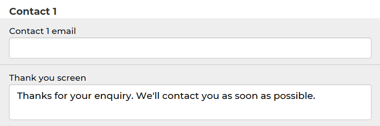
As a website owner, all contact form messages are delivered to your email inbox, to an email address of your choice and you can also control the 'Thank You' screen which appears when a contact form message is submitted.
Please note that all the contact forms are completely optional and you can turn them on or off, according to your needs.
You can add your own text information above the main parts of the form, to customise its appearance for your needs.
For example, if you have a holiday home rental website, you could use this form for a booking request, and then add the appropriate text to sit above the form.
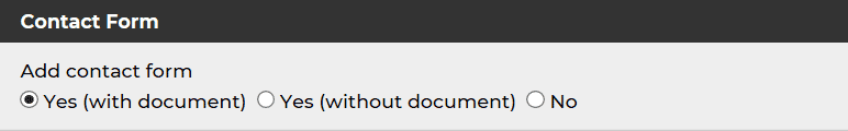
Ideal for creating a job application form on recruitment sites, this contact form will allow people to submit a document attachment (Word, PDF) along with the contact form message submission.
All job applications with CV / Resume document attachments are automatically delivered directly to your email inbox.
Placed within the footer of the website, this is a simple email entry form which allows people to join your mailing list.
However, please note we do not provide any way to generate a bulk mailing or send the mailing to people who wish to join your mailing list.
Supposing you decided to email out a monthly newsletter or quarterly newsletter, this feature could be used to allow people to join the newsletter mailing list in the future.
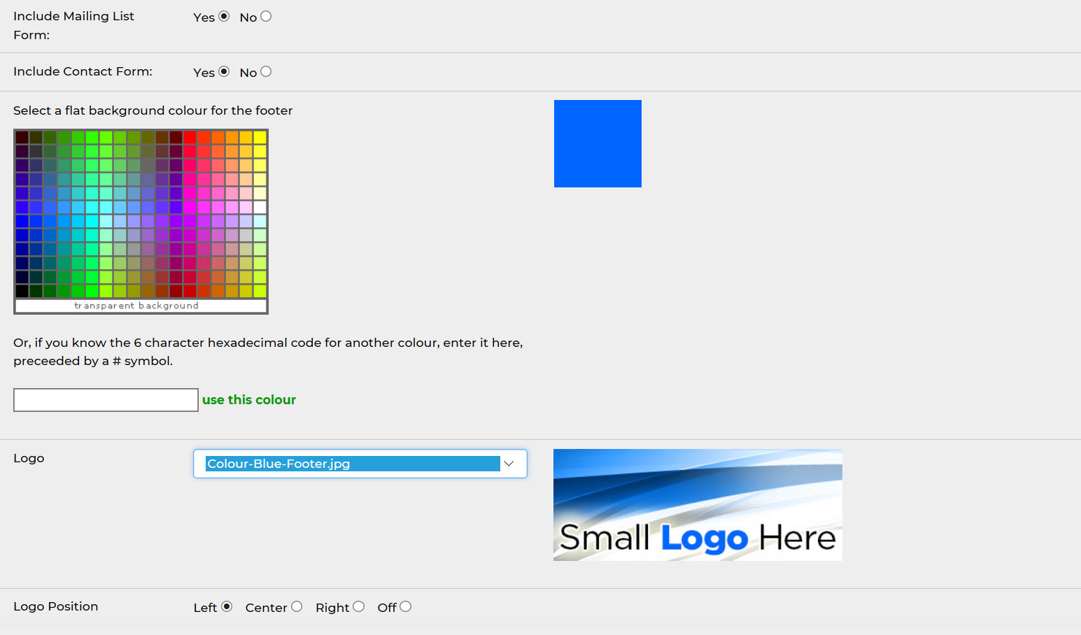
Available right across your entire website, the footer of your website at the bottom right corner contains a simple contact form.
The 'Footer' has a simple text editor to type, edit and format the text in the middle section of the footer at the bottom of the website
Sitting at the bottom of your website, it comprises of 4 main elements:
1) Logo (a smaller version of your logo which appears at the top of your website).
2) Mailing list contact form.
3) Text area, for you to summarise your website description.
4) Contact form.
You can turn these elements on or off, according to your preference.
We make it easy for you to plan for search engines, optimise your web pages and submit your website to the search engine robots. All of your web pages can be indexed and listed on all of the major search engines, including Google and Bing.
To help you get started, we recommend you carry out three simple steps, or what we call the Bare Minimum SEO and we will be happy to share our intelligence with you.
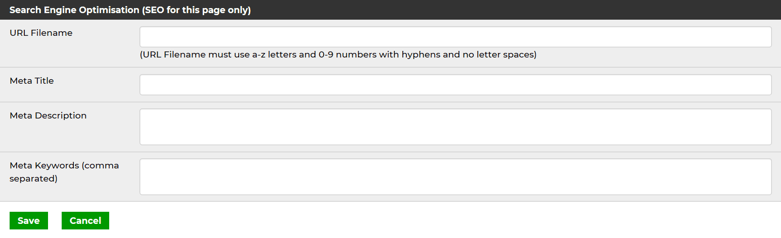
When you edit each page or each gallery item, you can add a page title to improve your chances in search engines.
Page titles are the blue titles which appears on the Google search engine results pages (SERPs).
When you edit each page or each gallery item, you can add a URL to improve your chances in search engines.
URLs are the green website addresses which appears on the Google search engine results pages (SERPs).
When you edit each page or each gallery item, you can add a summary description to improve your chances in search engines.
This is the small 'snippet' description which appears on the Google search engine results pages (SERPs).
Free of charge, you can use Google Analytics and Google Webmaster Tools for advanced information about your website visitors.
These tools provide a wealth of information about your website traffic, including locations, behaviour, mobile phones users versus non-mobile and the traffic sources (how they found your website).
For added security, your Toolkit is designed to timeout after 30 minutes of inactivity, to prevent the risk of unauthorised access to your website.
This will be your own unique web address, along the lines of www.customersite.quickonthenet.com
You can also upgrade your site and use your own domain name.
Website hosting is included as part of your website service package.
We have consolidated our help and support tools into a new Support Centre to make it quick and easy for you to get the answers you need.
We provide online help just where you need it. Our help system is branded as Quick Help and it provides what is known as "context sensitive help". In other words, if you're uploading pictures, and you need help, it will take you straight to the help section which deals with pictures.
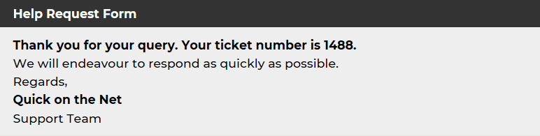
QUICK ON THE NET customers receive a personalised help service, whereby we can answer specific questions and respond by email.
If you need help and you submit a help request, you will receive a support ticket number and you will also receive an email copy of your help request for your own records.
Whenever possible, we endeavour to respond to customer help requests within 24 hours and very often we can respond within minutes.
Furthermore, we also provide a 24/7 online help system.